Typography plays an important role in shaping how users perceive and interact with digital content. It’s not just about selecting appealing fonts, but also about ensuring a balance between aesthetics and functionality. Great typography enhances readability, conveys the intended mood or emotion, and reinforces brand identity, all of which can leave a lasting impression on users.
Principles of Typography in Web Design
Readability At its core, typography should make content easy to read and understand. Fonts with clear, distinguishable characters work best for body text. For example, sans-serif fonts like Roboto, Open Sans, and Lato have become popular choices in digital design because of their clean and modern look. Imagine reading a blog post on a mobile device; a font like Roboto would ensure the text remains crisp and legible across varying screen sizes.
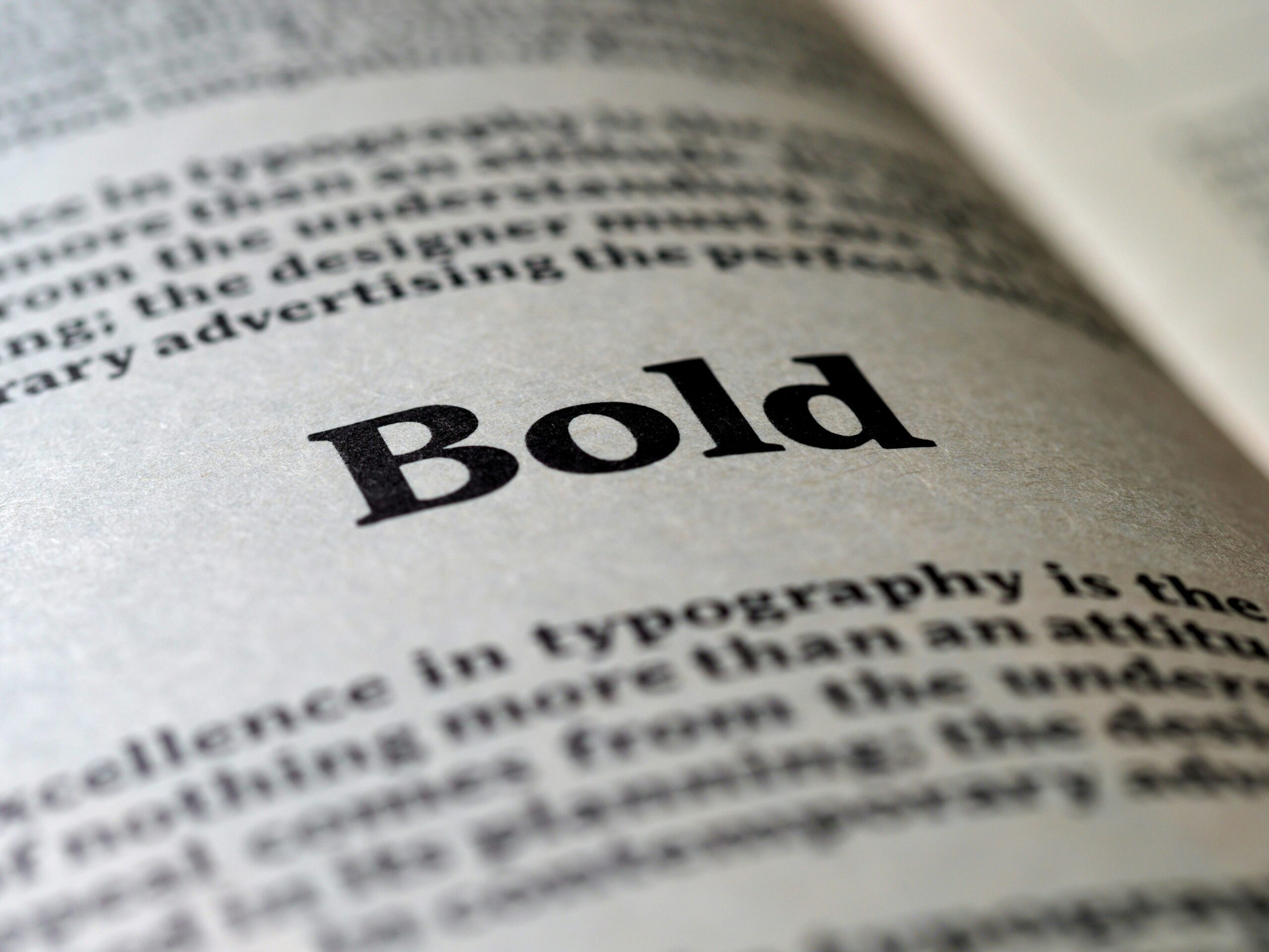
Hierarchy Typography can guide users’ attention through the use of visual hierarchy. A clear distinction between headings, subheadings, and body text allows users to scan content effortlessly. For example, using bold, larger fonts for headings like “H1” and lighter, smaller fonts for body text improves clarity. Think of a news website where headlines grab attention immediately, while smaller paragraphs provide the story details.
Contrast Contrast between text and background colors is essential to ensure legibility. Dark text on a light background, or vice versa, is the most effective. A landing page for a product, for example, can use a clean white background with black text to maintain clarity while ensuring a professional and polished look. Avoid combinations that strain the eyes, such as light gray text on a white background.

Pairing Fonts Effectively
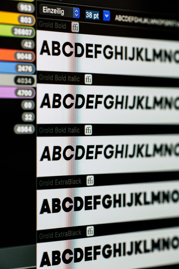
Pairing fonts is a nuanced aspect of typography that requires balancing complementarity with contrast. A popular strategy is to use one font style for headings and a different but harmonious style for body text. For example, pairing a bold sans-serif font like Montserrat for headings with a serif font like Georgia for body text creates a visually engaging contrast.
Here’s an example scenario: imagine a recipe website. Use a modern serif font like Playfair Display for titles to convey sophistication, paired with a readable sans-serif font like Lato for instructions to ensure practicality. When done right, pairing fonts not only enhances the design but also creates a cohesive brand personality. To simplify the pairing process, tools like Google Fonts provide suggestions for harmonious font combinations.
Why Typography Matters
Typography is more than just an aesthetic tool, it’s a functional component of user experience. Poor font choices can make content difficult to read. This leads to user frustration and increased bounce rates. On the other hand, thoughtful typography can make websites more engaging, encourage users to stay longer, and improve comprehension.
By understanding the principles of typography and using tools like Google Fonts or Adobe Fonts, designers can make more informed decisions. Whether you’re building a simple blog, a high end e-commerce platform, or a creative portfolio, typography has the power to elevate your design and create an experience users will love.