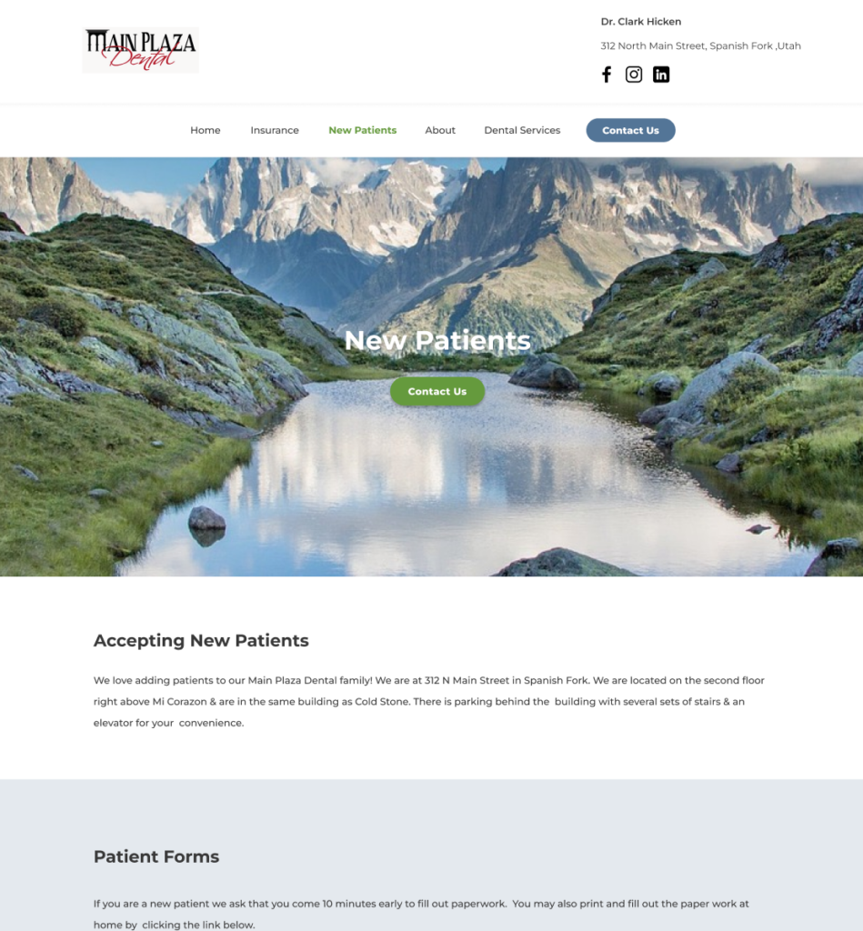
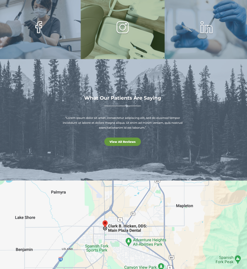
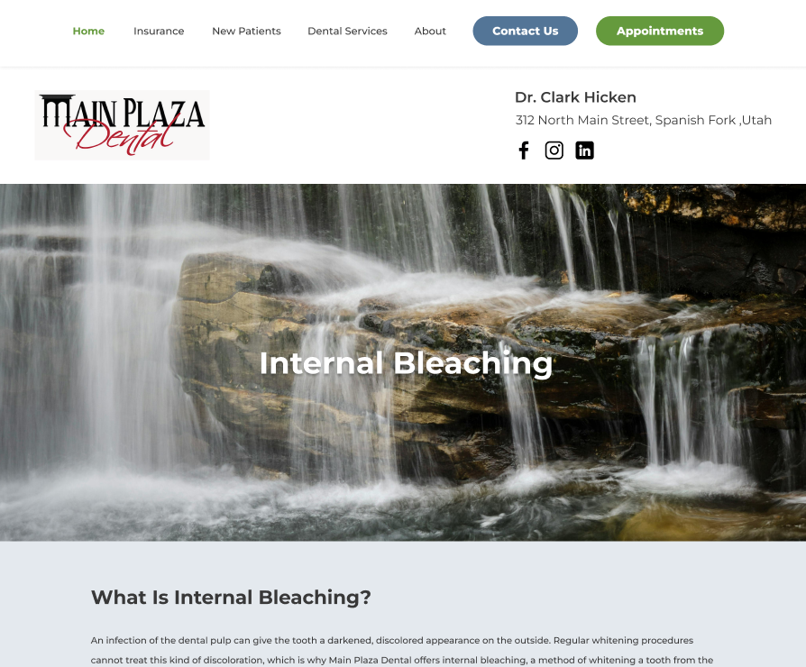
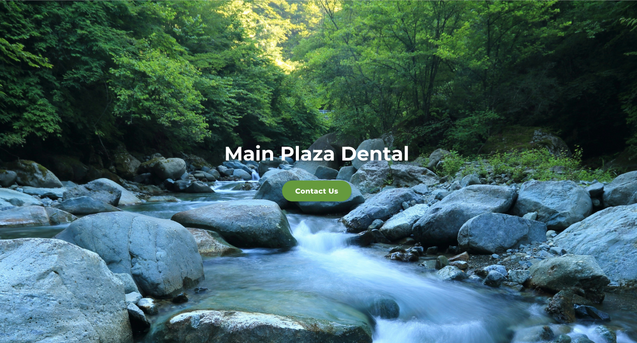
In this case study, we’ll take you through a recent project we completed for a client in the medical sector. We’ll showcase how we approached the design challenge, the key decisions we made, and how these choices contributed to a remarkable user experience and a stronger digital presence for our client.
The Challenge: Redesigning for Clarity and Conversion
Our client, Dr. Clark from Main Plaza Dental, came to us with an outdated website that wasn’t performing as well as it could. While the site was functional, users were struggling to navigate, find information, and ultimately convert. There were several key issues:
- Confusing navigation: Visitors had difficulty finding core content. The way navigation menu items were laid out was not ideal.
- Disorganized Layout: The layout looked too cluttered making information difficult to find and navigate.
- Outdated design elements: Many of the design elements looked outdated, such as large white boxes for text and images.


The client wanted a website that was not only visually appealing but also easy to navigate, aesthetically pleasing, and capable of driving more conversions.
Prioritizing UX at Every Step
1. Research & Analysis
Before we dove into the design work, we took the time to deeply understand both the business goals and user needs. This included asking ourselves:
- Who are the primary visitors?
- What are their goals?
- What challenges do they face?
- What are their competitors doing right (and/or wrong).
2. Wireframing & Prototyping
Once we had a clear understanding of the project, we began with wireframes, basic, low fidelity layouts to establish the structure of the site. This allowed us to focus on the functionality and user flow before getting caught up in visual design elements.
Here’s a screenshot of one of the wireframes we used to streamline the navigation process:

In this wireframe, we are working through all of the menu items so that users are able to navigate the site easily.
3. Visual Design: Bringing It to Life
With wireframes and prototypes in place, it was time to move into high fidelity visual design. We maintained a balance between aesthetics and usability, ensuring the design was clean, modern, and aligned with the client’s branding.
- Consistent Typography and Color Palette: We chose fonts and colors that are easy to read and aligned with the client’s brand identity.
- Whitespace: By incorporating ample whitespace, we created a more breathable design that felt less cluttered and more inviting.
- Imagery & Icons: We used custom illustrations and imagery that connected emotionally with users while also improving the site’s accessibility.
Here’s a screenshot showcasing some of the final designs for this website:


Takeaways: Why UX Design Matters
This case study illustrates the powerful impact that good UX design can have on a website’s performance. By prioritizing usability, accessibility, and design principles, we were able to create a site that not only looks great but also functions optimally, driving better engagement and conversions for the client.
At Bright Bridge, we believe that great design is about more than just aesthetics. It’s about crafting experiences that resonate with users, build trust, and drive results. Whether you’re looking to redesign your current site or build one from scratch, we are here to help you create a digital experience that works for your business.


