In this case study, we’ll dive into the process of balancing a bold visual identity with an intuitive user experience. We’ll explore the key challenges we faced, the creative solutions we implemented, and how we successfully delivered a website that was both functional and aligned with Y2Analytics’ brand.
The Challenge: Bold Branding Meets Functional Web Design
Y2Analytics came to us with very specific requirements for their new website. As a marketing company, they wanted their digital presence to reflect their unique identity, which is defined by:
- A striking blue and orange color palette
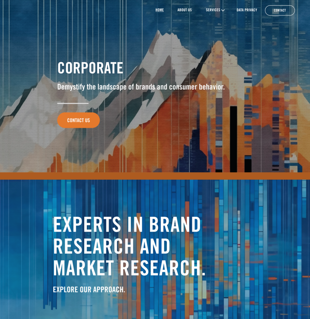
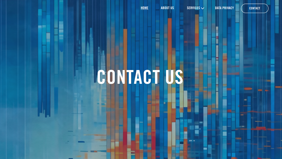
- Abstract nature paintings that the client themselves created, which needed to be incorporated into the website

While we were excited to work with such a unique brief, the challenge was clear: how do we balance artistic expression with usability and ensure the website serves its primary function, delivering critical information to potential clients and generating leads?
Our Approach: Designing with Purpose and Creativity
1. Understanding Y2Analytics’ Brand Vision
Before we dove into the design, we took time to fully understand Y2Analytics’ mission, audience, and visual identity. Their branding was deeply tied to their creative nature, which is reflected in the abstract art they create. At the same time, they are a data driven marketing analytics company that relies on trust, credibility, and clarity to engage clients.
Our goal was to:
- Retain the boldness of the blue and orange color scheme.
- Ensure that the abstract art enhanced the user experience without overwhelming it.
- Create a modern, responsive design that still felt grounded in Y2Analytics’ creative identity.
2. Color Scheme: Bold but Balanced
Y2Analytics requested a blue and orange color palette, two strong, contrasting colors that can easily overwhelm a design if not handled correctly. To ensure the website was visually striking but still user-friendly, we followed these design principles:
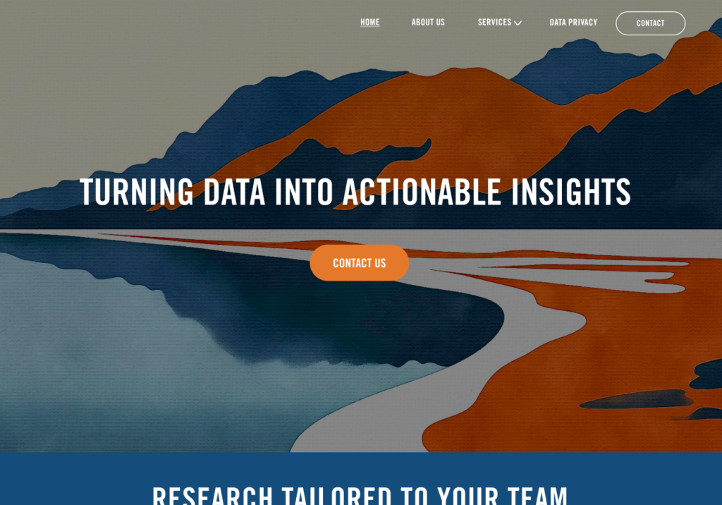
- Blue as the dominant color: Since blue is often associated with trust, professionalism, and reliability, we used it as the primary color for headings, CTAs, and backgrounds.
- Orange as an accent: We used orange strategically as an accent color for buttons, highlights, and key details to draw attention without overpowering the design.
- Neutral tones for balance: To prevent the palette from feeling too saturated, we incorporated neutral shades like white, gray, and black for text and backgrounds, allowing the bold colors to stand out while maintaining a clean, professional look.
3. Incorporating Abstract Nature Artwork
One of the most exciting aspects of this project was working with Y2Analytics’ abstract nature paintings. The client’s artwork had a deep personal and emotional connection to their brand, and they were adamant about having it play a central role in the site’s design.

Our goal was to:
- Use the art as a focal point on key pages, such as the homepage and service pages, while ensuring it didn’t distract from the site’s functionality.
- Create a visual flow: We ensured the artwork flowed smoothly with the content, so it enhanced the message rather than competing with it.
Here’s a screenshot showing how the abstract nature artwork was integrated into the homepage:
4. Typography and Layout: Staying User Centered
While the art and bold colors were essential, we couldn’t lose sight of the need for clarity and readability. The layout and typography had to support the content and provide a seamless user experience. We focused on:
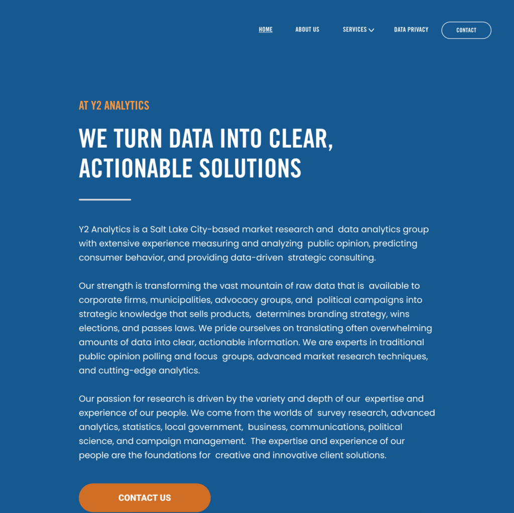
- Clear and legible fonts: We selected modern, sans-serif fonts that provided excellent readability across devices while still fitting with the bold, creative theme.
- Whitespace and hierarchy: We ensured there was enough whitespace around text and art, making the content easy to digest while keeping the page from feeling too crowded or chaotic.
Key Takeaways: Designing for Creative Clients
This case study underscores the importance of balancing creative expression with user centered design. For Y2Analytics, we had to ensure their vibrant branding and artwork didn’t overwhelm the site’s functionality. By carefully managing the color palette, artwork placement, and layout, we created a website that:
- Successfully showcased the client’s artistic vision.
- Stayed true to their brand identity.
- Prioritized usability and conversion.
